



UI Design

This is the layer your users see and touch. We design high-fidelity interfaces that carry your brand and make every interaction feel effortless, built on solid UX underneath and ready to hand to developers.

Outlined triangle icon with rounded corners in a red-to-yellow gradient, part of a set of geometric brand icons.

TRUSTED BY TEAMS AT:

  • Deutsche Telekom logo: white stylised letter T on a magenta background
  • Uniper logo in blue, showing the word "uniper" split across two lines.
  • GOLDBECK logo in bold black uppercase letters on a white background
  • PwC logo featuring the lowercase letters "pwc" in black with two orange diagonal shapes above
  • Vattenfall logo with the name in dark grey bold letters and a circle split into yellow upper half and blue lower half on the right
  • Schwarz-produktion logo on a white background reading “SCHWARZ PRODUKTION” in white text inside a dark blue square.
  • Cornelsen logo — white bold wordmark on a red background
  • Meridiam logo with tagline "for people and the planet" in dark green on a white background.

Pixel-perfect, down to the last detail

We craft high-fidelity screens with clear visual hierarchy and interactions that feel obvious. Every element earns its place, from the overall layout down to custom icons drawn to match your product's look and feel. The result is an interface that stays professional and consistent everywhere a user looks.
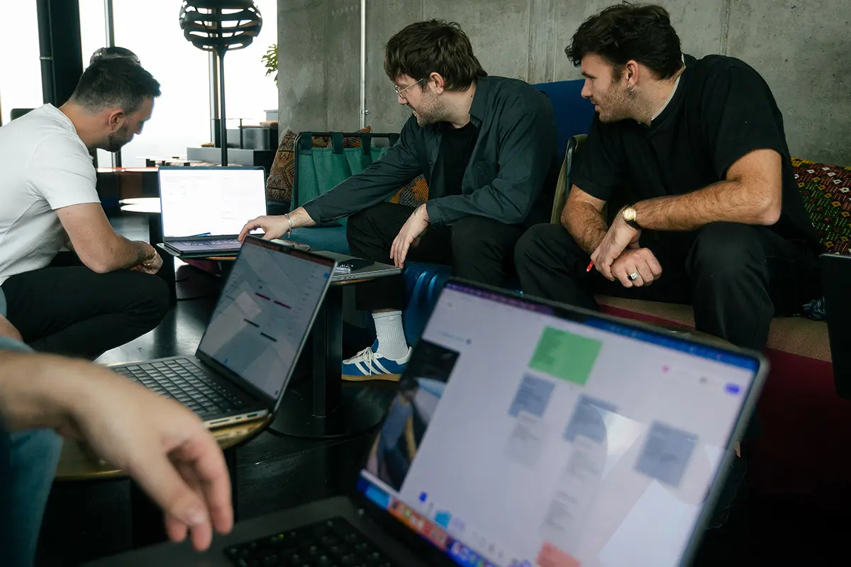

Three colleagues reviewing laptop screens together on a couch, one pointing at a document on his laptop while others look on.

Design that responds the way people expect

Good interfaces react. We design the animations, transitions, and micro-interactions that make an application feel alive and guide people through it without a manual. Then we bring it to life in high-fidelity prototypes, so you can experience the real thing and give feedback before a line of code is written.

Man with a beard wearing a black "eightreasons" hoodie, looking to the side in an industrial-style room with hanging plants and exposed ceiling fixtures.

Complex data, made readable at a glance

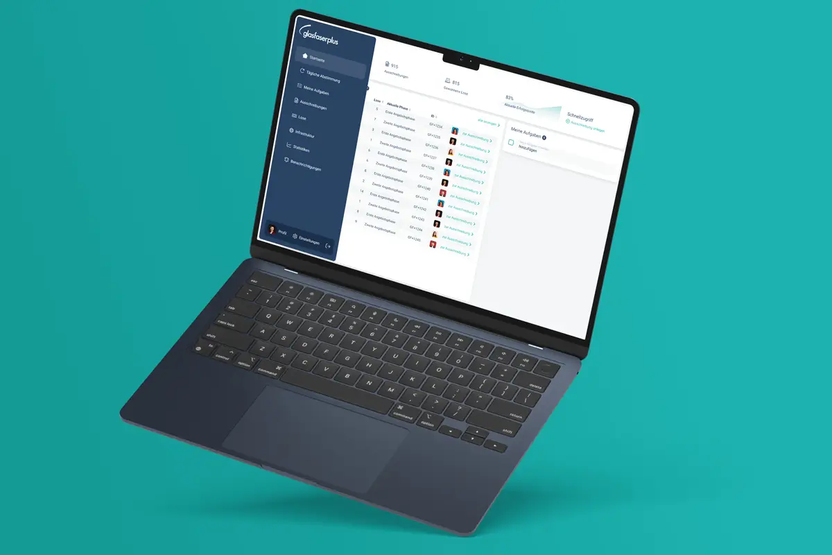
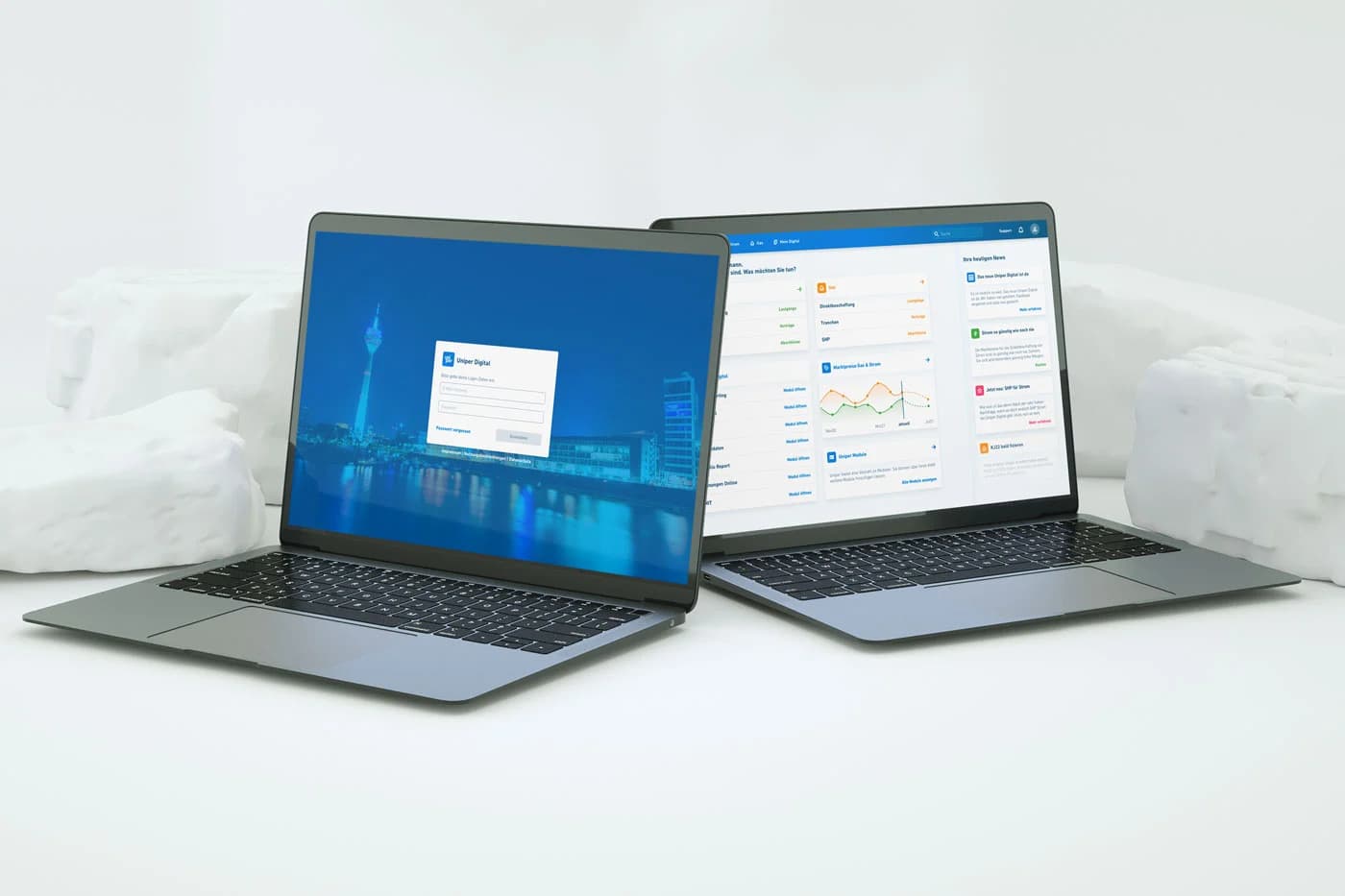
Dense numbers don't have to mean dense screens. We turn complicated data into dashboards and visualisations people can understand and act on quickly. Clear structure and smart hierarchy do the heavy lifting, so users spot what matters without digging for it.

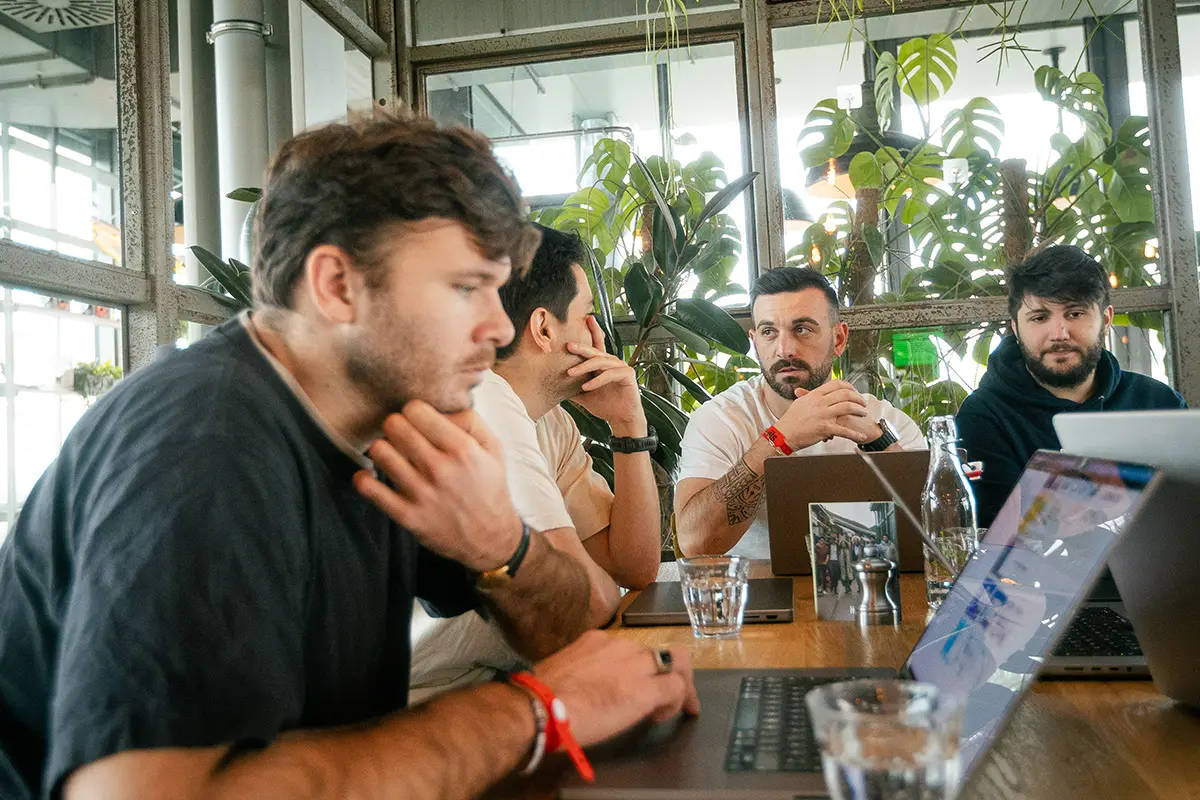
Four coworkers seated around a table with laptops and water glasses, deep in discussion surrounded by large windows and greenery.

How working with us actually goes

  1. Step 01

    Initial requirement meeting

    We review your brand and the UX groundwork the interface will build on.

  2. Step 02

    Visual direction

    We define the look and feel, exploring styles that fit your brand and audience.

  3. Step 03

    Design and prototype

    We design the full set of screens, then bring them to life as an interactive prototype we refine on your feedback.

  4. Step 04

    Developer handover

    We hand over clean designs and tokens your team can build from directly.

Working with 8reasons was a valuable experience for us. With their structured and user‑centered approach, they developed our new front end from the ground up in collaboration with us. Their professional methodology deserves special mention—from the analysis through various drafts to the final design, the process was constructive and efficient. The result is a modern, user‑friendly interface that takes our applications to a whole new level. All in all, a great job that we’re happy to recommend.
glasfaserplus logo on a dark blue background, featuring a curved fibre-optic cable graphic alongside the wordmark "glasfaserplus"Simon BernardHead of IT · GlasfaserPlus GmbH

Make it look as good as it works.

Bring us your flows or your brand, and we'll design an interface people enjoy using.