




Design Systems

As a product grows, so does the drift: mismatched buttons, three versions of the same component. A design system fixes that at the source, with the libraries, patterns, and guidelines that keep every screen consistent and every team moving faster.

Outlined hexagon icon with a green-to-yellow gradient, part of a set of geometric brand icons.

TRUSTED BY TEAMS AT:

  • Deutsche Telekom logo: white stylised letter T on a magenta background
  • Uniper logo in blue, showing the word "uniper" split across two lines.
  • GOLDBECK logo in bold black uppercase letters on a white background
  • PwC logo featuring the lowercase letters "pwc" in black with two orange diagonal shapes above
  • Vattenfall logo with the name in dark grey bold letters and a circle split into yellow upper half and blue lower half on the right
  • Schwarz-produktion logo on a white background reading “SCHWARZ PRODUKTION” in white text inside a dark blue square.
  • Cornelsen logo — white bold wordmark on a red background
  • Meridiam logo with tagline "for people and the planet" in dark green on a white background.

Build once, reuse everywhere

Reusable components are the engine of a design system. We create UI libraries of ready-made building blocks and document the interaction patterns behind them, so teams stop rebuilding the same things and the product stays consistent from screen to screen. Design speeds up, and there are far fewer inconsistencies to chase down later.
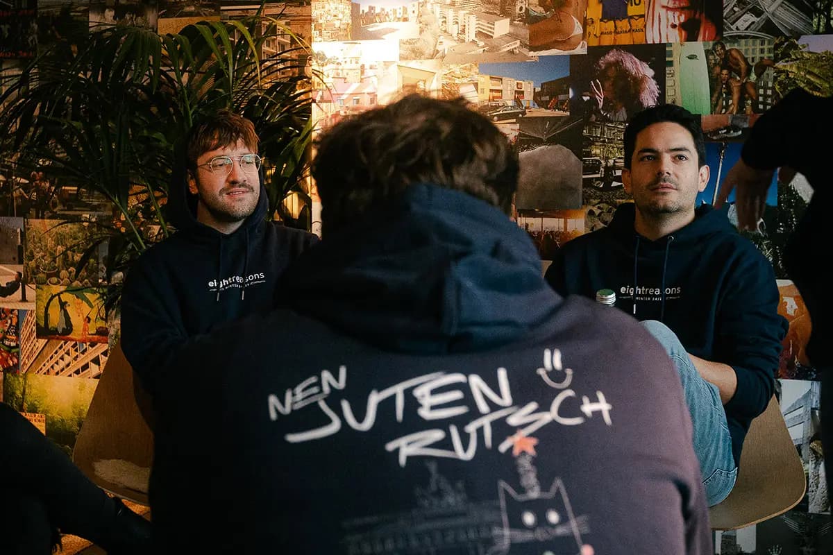
Two men in matching dark hoodies sitting and talking with a third colleague, in front of a wall covered with collage-style photos.

Your brand, consistent in every corner

Your identity should feel the same in a customer-facing app or an internal tool. We define clear guidelines for colour, typography, imagery, and tone, plus style guides that set the standards for components and interactions. Everyone from designers to developers works from the same rules, so nothing drifts out of line.

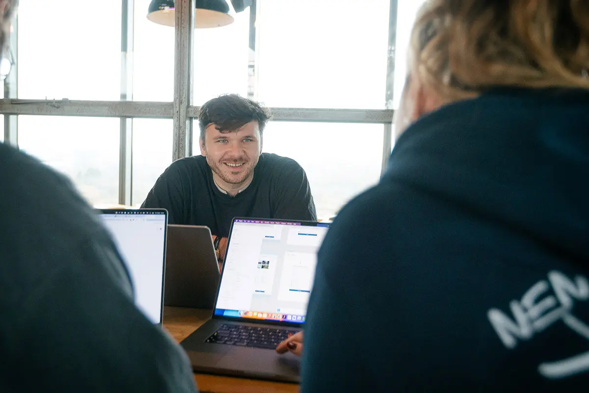
Man in a dark sweater smiling at the camera during a meeting, with laptop screens and two colleagues visible in the foreground.

Accessibility, built in from the start

Accessibility is now a legal requirement under BFSG and WCAG, and it belongs in the system from day one. We build compliance into the components and guidelines themselves, so they meet the requirements out of the box. Every product built on the system is then usable by more people, and covered on regulation that now applies across the EU.

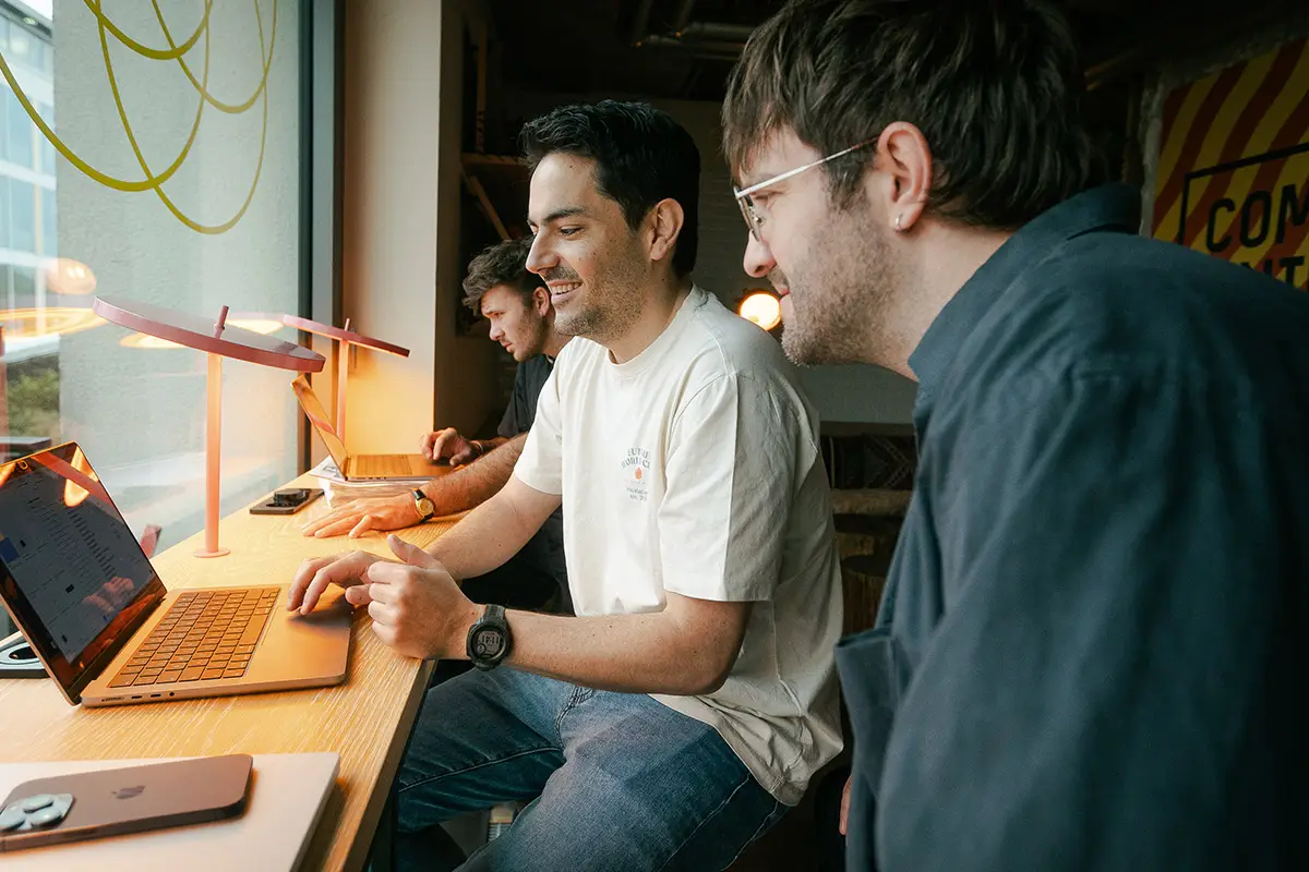
Man in a white t-shirt smiling while typing on a laptop at a wooden desk, with two other colleagues working on laptops in the background near a large window.

How working with us actually goes

  1. Step 01

    Initial requirement meeting

    We look at your existing products and the teams who'll use the system.

  2. Step 02

    Audit and inventory

    We review what you already have, cataloguing your existing components and where they've drifted apart.

  3. Step 03

    Foundations and components

    We define the core tokens like colour, type, spacing, and grid, then build and document the reusable components and patterns on top.

  4. Step 04

    Rollout and handover

    We hand over a living system your designers and developers can use and extend.

Highly recommended!! With 8-reasons, we completely revamped our “aging” online platform and designed a brand‑new UI/UX. After a thorough assessment of the current state, a large‑scale online survey, and in‑person customer interviews, we left no stone unturned together with 8-reasons. What impressed me most was how well you can grasp complex processes and products and then translate them into simple, user‑friendly workflows. Our platform has become more intuitive; many processes are now streamlined and clearer—not to mention that the overall look is now more visually appealing and harmonious. We’ve received excellent feedback from our customers and colleagues and are enjoying the benefit of many features now working simply and intuitively. Alex from 8-reasons continues to be consulted today on new developments and enhancements for our Uniper Digital online platform, and I always look forward to his ideas and designs! Thank you!
uniper logoMareike SchröterDigital Sales Project Manager · Uniper SE

One system, every screen.

Show us where your product has drifted, and we'll build the system that keeps it consistent.